
Cropping and centering fixed-size elements with CSS
Cropping and centering fixed-width elements with CSS Cropping and centering fixed-width elements with CSS seems, at first view, a fairly simple procedure. But in truth, it's actually a little more complicated. This week, one of my students asked me if I could show him how to make sure that the mid-point of an image always remained in the dead center of it's container as the browser window was scaled. It's fairly simple to use responsive CSS to scale the image down as the container resizes with the browser, but this wasn't the goal - the requirement was that the image [...]
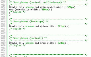
CSS media breakpoints
CSS media breakpoints cheatsheet I get asked quite frequently for CSS media breakpoints, and although this list is probably far more than you would ever use in a production environment, it's useful to have as a reference for those special times when you want something pixel-perfect. Personally, I'm of the opinion that it's pointless to develop a website that's not responsive - ie a website that uses media queries to rearrange layouts when the viewport changes. Not only will multiple users with various-sized devices be able to read the content more clearly, but search engines are more savvy these days with [...]
 | © 2014 John Ryan Design | All Rights Reserved | 100 percent Australian |